
Time was, if you were a football fan who was also into fashion, you never actually wore your team’s shirt, with the possible exception of on the five-a-side pitch. Representing, as it’s known, was strictly for ‘scarfers’ (a term used to describe regular football fans, not the casuals draped in Stone Island). Now, retro football shirts are in fashion, from streetwear to the catwalk.
“I first started noticing skate kids wearing football shirts a couple of years ago,” says Neal Heard, a fashion consultant and, as the author of the book A Lover’s Guide to Football Shirts and curator of the exhibition The Art of the Football Shirt, one of the foremost authorities on the beautiful game’s most beautiful garms. “I clocked [someone] in my local place, back in Wales, in a Manchester United shirt, and I thought, ‘how odd.’”
With their hat-trick of team, manufacturer and sponsor, retro football shirts are a “holy grail of branding” in this logo-centric age, says Heard: a three-in-one-billboard of meanings that can transport those able to interpret them to a particular time and place. At the same time, they’re worn as a sort of “anti-statement” by skaters or hip-hop artists with no affiliation or knowledge of their associations. Snoop Dogg probably isn’t a Norwich City supporter.
What Heard calls the “basketball-isation” of football is not entirely a postmodern phenomenon, it’s also a strategy by marketers to take their outfits “outside of the traditional tribalism” in the way that a New York Yankees cap transcends baseball: witness the recent code-switching collaboration between Paris Saint-Germain and Nike’s Jordan brand. The ultimate goal for a team – sorry, brand – is to be a fixture in the “urban look”.
Cynical as that may sound, what retro football shirts still bestow, and what fashion wants to borrow, is authenticity. “If you’re doing so with, let’s call it ‘honour’, then it’s going to come across,” says Heard, whose own Lover’s FC brand has collaborated with department store Selfridges and London-based fashion label YMC. “There’s this treading between lines, which people can get wrong.”
A self-confessed football shirt nerd, Heard perhaps surprisingly rails against replaying past highlights out of sentiment. Instead, he insists that the best retro football shirts, like those below, should be appreciated not just for what they signify, in football, music or even politics, but also for their design in their own right. And above all, “because they’re cool”.
These are our favourite shirts from the leagues and eras that matter most.
English Football
Early Nineties
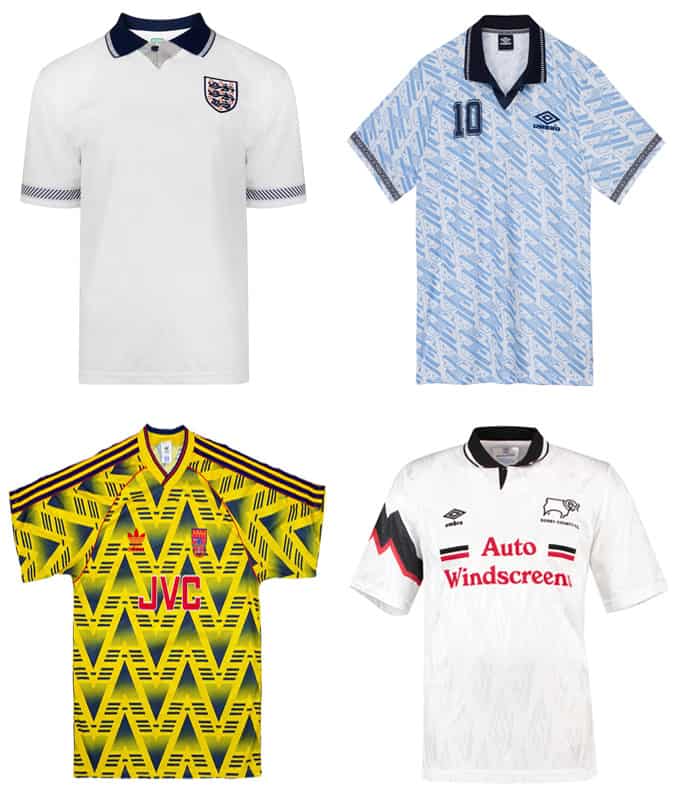
This trippy, music-fused period of kit design is often referred to as ‘Acid House’, partly because Umbro, one of its pioneers, was based in Manchester, the home of the rave scene, and partly because the psychedelic nature of the kits suggested that their designers were under the influence of mind-altering substances. (In fact, the iconic blue England 1990-92 third shirt worn by New Order in the video for ‘World in Motion’ was created by shining light through an old glass ashtray and photocopying the patterns.)
The nostalgia for all things nineties in fashion generally has seen renewed interested in and reconsideration of these visual stimulants, many of which were widely reviled at the time.
If Adidas doesn’t unveil something inspired by Arsenal’s infamous ‘bruised banana’ 1991-93 away shirt, now celebrated by north London hipsters, they’re missing an open goal. Even Heard, who admits that he “probably hated most of them at the time”, has come around.

Italian Serie A
Late Eighties, Early Nineties
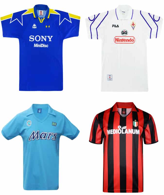
Like the music that you listen to in your teens, which stays with you for life, pretty much any shirt from this era will weaken the knees of men old enough to remember Channel 4’s Football Italia, which brought free-to-air, sexily foreign soccer to the masses at the point of the pay-per-view Premiership’s 1992 inception. Skate brand Palace even created a typically cheeky homage to Juventus’ 1997-98 shirt manufactured by Kappa with a Sony Minidisc (or in Palace’s case, ‘Minirisc’) sponsor logo.
Meanwhile, the Nintendo-emblazoned Fiorentina shirts from the heyday of Gabriel Batistuta, manufactured by terrace fashion favourite Fila, are, to Heard’s mind, where the notion of a “good” or even “cool” sponsor’s logo originated (if not with Diego Maradona’s Napoli and Mars).
As cult broadcaster James Richardson, the erstwhile cappuccino-sipping host of Football Italia, now of the Totally Football Show podcast, might say: “Woof!”

J-League
Early Nineties On
Trust the style-obsessed and, in the best possible way, slightly sartorially bonkers Japanese to inimitably interpret football’s dress code for the J-League, which kicked off in 1993, and fully exploit their off-the-radar remoteness in order to experiment.
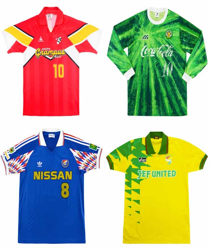
“They did their own take,” says Heard. “That’s why I was always drawn to their shirts because, quite frankly, they’re crazy.” Suitably lunatic examples are the tie-dye Tokyo Verdy 1992-93 shirts – green on green for home, white with green for away – by Japanese manufacturer Mizuno with Coca-Cola as the chest sponsor and McDonald’s golden arches on the sleeve. “You can almost see the point where they put the fork in and span it,” says Heard. “That just blew my mind.”
More so even than the aforementioned ‘Acid House’ era. “It was so fresh,” says Heard, who also includes Nagoya Grampus Eight shirts by Mizuno (1995-96) and Le Coq Sportif (1994-95) in A Lover’s Guide. “The J-League had the approach of ‘Let’s start again’, and lots of interesting things came out of it.”

Brazilian Football
Late Eighties, Early Nineties
In the nineties, the influential menswear store and brand Duffer of St George started importing Brazilian club shirts around the time that Football Italia was making the sport, or at least its foreign incarnations, newly fashionable.
Heard, who picked up Gremio and Flamengo, estimates he now owns 20-odd Brazilian club shirts dating from between 1989-91. “I love those shirts when they’re made by Penalty, Topper and all the big Brazilian brands that we never saw,” he says. “The branding’s big and different. You’ve never heard of it. I don’t really want to see Adidas, Nike or anything like that on a Brazilian shirt.”
Heard is also a sucker for the then-ubiquitous and undeniably iconic Coca-Cola sponsor logo, despite its connotations: “I’m somebody who likes to think he’s a really trendy antique-brand hippie, but if you put Coca-Cola on it, I want to buy it.” Gremio’s light-blue-and-black-striped shirt – based on that of somewhat less exotic Exeter City – has twice been named most beautiful kit by French style magazine Monet.

North American Soccer League
Late Seventies, Early Eighties
The North American Soccer League, which ran from 1968 to 1984, was the first attempt to colonise the continent with the other kind of football, with past-its-sell-by-date stardust sprinkled by the likes of Pele, Johan Cruyff and George Best.
“I like the way the NASL came at it, which was really brash and American, and totally different to how the whole traditional footballing world did it,” says Heard. “Some of it was a bit over the top, some of it – I think – was great.”
In American sports franchise fashion, the names of the teams often took the place of a sponsor’s logo on the chest – a canny piece of branding that seems prescient in the age of Gucci logo tees. Another NASL innovation that Heard describes as “so ahead of its time” was that fashion designers were tapped to make the “uniforms” – preppy Ralph Lauren for the New York Cosmos, which pulled in most of the star-name players (Pele, Carlos Alberto, Franz Beckenbauer) and Halston for the Chicago Sting. “What I do think will happen soon is you’ll probably find Louis Vuitton will do a Paris Saint-Germain shirt.”

Be the first to comment